
A Framework for Understanding the Oil Market
Bottom Line
We set out to build a practical framework for reading oil, and the research kept pointing back to a simple structure: a US-led supply base, an Asia-led demand base, four distinct regional markets, and a small set of price levers led by OPEC spare capacity, inventories, the dollar, and the crude-to-products margin channel. The strongest evidence is that supply has re-centred from OPEC to the United States, with OPEC's share of world production falling from 35.2% in 2000 to 27.5% in 2024 while US total liquids output more than doubled from 9.1 to 22.8 mb/d, even as demand has re-centred toward China and India. For readers, the point is that oil is easiest to misread when we start with the headline scare; the more reliable sequence is to start with the market's structure and levers, then ask whether a geopolitical event is actually converting into a measurable supply shock.
Thesis
We began with a broad question: what is the cleanest way to understand the oil market without collapsing into daily noise or one-cause stories? What we found is a framework that is simpler than the flow of headlines but more demanding than the usual narrative. The market is anchored by a few supply centers, a few demand centers, three pricing benchmarks, and two chokepoints, but price does not respond to all of them equally. Our work kept pointing back to buffer variables and transmission channels: OPEC spare capacity as the main volatility gate, US shale as the slow-response cap on sustained spikes, inventories as a deviation-from-normal signal, the US dollar as a macro overlay, and the crack spread as the path from crude into retail fuel. We then used that framework to stress-test oil history and, only at the end, to evaluate Iran and the Strait of Hormuz as a case study in when a familiar market narrative is wrong and when it becomes literally true.
Evidence
The map is smaller than it looks
The first question we were trying to answer was basic: what, concretely, is the global oil market? The structural map is compact. On the supply side, the three anchor producers are the United States, Saudi Arabia, and Russia. In 2024, US total liquids output reached 22.84 mb/d, with 13.23 mb/d of crude, versus roughly 9.9 mb/d for Russia and 9.2 mb/d for Saudi Arabia. On the demand side, the three anchor consumers are the United States at about 20.4 mb/d, China at 16.2, and India at 5.4.
The pricing side is similarly concentrated. WTI remains the North American benchmark, Brent the main seaborne global benchmark, and Dubai/Oman the benchmark for crude sold into Asia. The physical plumbing is narrow enough that two chokepoints dominate transmission risk: the Strait of Malacca at 23.7 mb/d in 2023 and the Strait of Hormuz at 20.9 mb/d, or about one-fifth of world oil use. That matters because any supply disruption or geopolitical stress has to show up somewhere, and these nodes are where the market registers it.
This is the first discipline of the framework. Oil may look like one global tape, but the useful starting point is not "price went up, why?" It is "which node moved?" The answer usually sits with a benchmark, a supply anchor, or a chokepoint rather than with the headline itself.
The center of gravity moved: supply to the US, demand to Asia
The next question was what changed in the market's center of gravity. On supply, the answer is the US. OPEC's share of world production fell from 35.2% in 2000 to 32.9% in 2010 and 27.5% in 2024, even though OPEC broadly held output flat. What changed was non-OPEC growth, and especially US growth. US total liquids output rose from 9.06 mb/d to 22.84 mb/d over that same span, making the US the world's largest producer by 2024 and the largest crude producer at 13.23 mb/d, ahead of Russia at 9.89 and Saudi Arabia at 9.23.
On demand, the answer is Asia. China's oil consumption rose from 2.33 mb/d in 1990 to 16.37 in 2024, about a seven-fold increase. India's rose from 1.17 to 5.60 mb/d, about a five-fold increase. OECD Europe, by contrast, stayed roughly flat, moving from 13.78 to 13.47 mb/d over the same period. The United States remains the single largest consumer at about 20.4 mb/d, but China has closed the gap materially, moving from well under half the US level in 2010 to roughly four-fifths by 2024.
OPEC's output (blue) stayed roughly flat while non-OPEC supply (orange) — led by US shale — drove nearly all the growth in world production; OPEC's share of the total fell from about 35% in 2000 to 27.5% in 2024. The shift of demand toward Asia is the second half of the same re-centring.
That double re-centring matters because it changes how to read risk. The market is no longer dominated by an OPEC-only supply story or a West-only demand story. It is better understood as a US-led supply expansion meeting Asia-led demand growth. That is also why chokepoints matter so much: the biggest structural dependency in the system is not US consumption, but Asia's need to import large volumes of crude through narrow sea lanes.
One headline price, four different regional machines
We then asked what sits underneath the single headline oil price. The answer is four regional markets that are linked, but not interchangeable.
The Americas are the self-sufficient machine. They are anchored by US production and price off WTI, which trades at a discount to Brent. The spread has averaged about -$5.85 to Brent, which is the market's way of pricing a region that broadly covers its own crude needs but still faces transport and export constraints. Put simply, WTI tends to be cheaper because US barrels are abundant and have to be moved out to the world market. This region is comparatively insulated on physical supply.
Europe is the mature import-dependent machine. It prices off Brent and pays the seaborne benchmark because it is structurally short crude. Its demand profile is mature rather than fast-growing, and after 2022 it became more dependent on replacement seaborne flows after losing much of its prior Russian supply path.
Asia-Pacific is the demand-and-refining engine. It prices off Dubai, carries about 35% of global refining capacity, and imports heavily because its demand far exceeds its production base. China alone nets roughly 11 mb/d of crude imports. This region is where the physical consequences of a Gulf disruption matter most.
The Middle East is the export-hub and balancing machine. The Gulf producers collectively pump about 24 mb/d and, crucially, hold much of the world's spare supply. Their oil is sold into other regions, especially Asia, and much of that flow runs through Hormuz. That is why the most consequential linkage in the whole map is the Middle East-to-Asia axis: the world's largest holder of spare capacity selling to the largest and fastest-growing import market through the least easily bypassed route.
This framing helps when we get to Hormuz. If Asia is the import engine and the Gulf is the export valve, then a Hormuz event is not first a generic fear story. It is first a regional flow story that may or may not widen into a global price shock.
What really moves oil prices
Once the regional structure was clear, we turned to the levers that actually move price. The strongest one in the framework is OPEC+ spare capacity. What we found is that it matters most as a volatility gate rather than a simple level setter. The only sustained period it fell below the 2 mb/d tight threshold was 2003-08, when it averaged 1.45 mb/d and the market ran into the super-spike toward roughly $147. The two loose-buffer regimes, the late 1990s and 2020, line up with the two major price routs. Over 1993-2026 the long-run mean is about 3.73 mb/d. The relationship to price is negative, meaning tighter spare capacity usually goes with higher oil prices, but the bigger practical point is simpler: when the cushion is thin, the market has less room to absorb a shock; when the cushion is large, shocks are easier to contain.
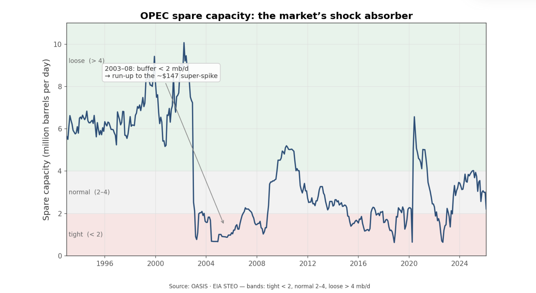
Spare capacity is the market's shock absorber. The most violent oil moves tend to happen when that buffer is already thin — the only sustained stretch below 2 mb/d, in 2003–08, ran straight into the ~$147 super-spike.
The next lever is US shale. The work here asked whether shale changed oil from a fixed supply market into a more elastic one. The evidence says yes. Rig-count changes lead production with a statistically meaningful relationship, and output per active rig nearly tripled from about 9,600 to 25,800 bbl/d between 2010 and 2024. In plain language, shale made US supply more responsive. A price shock no longer has to stay in place for years to invite new production; it can draw a domestic response within a few quarters.
Russia under sanctions was the third upstream test. Here the findings were more cautionary than dramatic. Russian output fell only modestly, from around 10.4 to 10.0 mb/d between 2021 and 2026, while the barrels Europe stopped buying were absorbed by Asia. We should read that as a flow-map story more than a supply-destruction story. It is a useful warning because the market often confuses route disruption with production loss. Sometimes they overlap, but not always.
Inventories and the dollar add the macro layer. The OECD-wide commercial stock signal matters more than the weekly US print. In a monthly decomposition of WTI returns, OECD stock changes carry a clear negative relationship with price, while US weekly stocks are only marginally useful on their own. The dollar is the strongest single measured driver in that model: when the dollar strengthens, oil usually becomes more expensive in local-currency terms for the rest of the world, which tends to weigh on demand and price. Even then, about 90% of the variance remains unexplained. That is a standing warning built into the framework: even a serious model leaves most month-to-month oil movement unexplained.
Finally, we wanted one downstream channel that links crude to the end user. The 3-2-1 crack spread does that. It measures the gross margin from turning three barrels of crude into two of gasoline and one of diesel. It averages about $10.6/bbl over 1986-2026, with a typical range of roughly $2-24, and moves cyclically with product tightness and refinery utilization. In simpler terms, it is the margin bridge between crude and the fuels households and businesses actually buy. That makes it the key translation layer from crude-market stress into pump-price pressure.
Taken together, these levers answer a question readers often ask implicitly: what should we weight heavily, and what should we discount? The framework's answer is spare capacity first, then the shale response function, then broad inventory deviations and the dollar, with the crack spread as the channel into products. The weekly US stock print matters much less than its visibility suggests.
History gives two durable rules
With the structural map and levers in place, we wanted to know whether history actually respects the framework. Across six episodes since the 1980s, two patterns dominated.
The first is that OPEC spare capacity governs amplitude. The most violent events formed on thin buffers. In 2008, WTI peaked at $144.41 and then collapsed to $35.88 by early 2009. In 2022, WTI rose to a $120.34 peak. In both cases the market was running on roughly 1-2 mb/d of spare capacity. In 2020, by contrast, the crash drove the buffer loose to around 4.2 mb/d.
The second pattern is that geopolitical spikes reverse unless barrels actually disappear. The 1990 Gulf War is the cleanest example. Iraqi and Kuwaiti output fell by about 4 mb/d combined, WTI jumped from roughly $16 to $40 in three months, and Saudi Arabia ramped from 6.4 to 8.1 mb/d to backfill the loss. Six months later WTI was 10.5% below its invasion-week level. The 2022 Russia/Ukraine shock showed a similar round trip. WTI rose 25% the week after the invasion and peaked near $120, but six months later it was only 1.1% above its invasion-week level because Russian barrels were rerouted rather than removed. Most tellingly, a model that included a broad geopolitical-risk index attributed just 0.4% of WTI's movement to it in that episode. In plain language, the war mattered, but geopolitical fear on its own explained almost none of the price move once the actual supply path was accounted for.
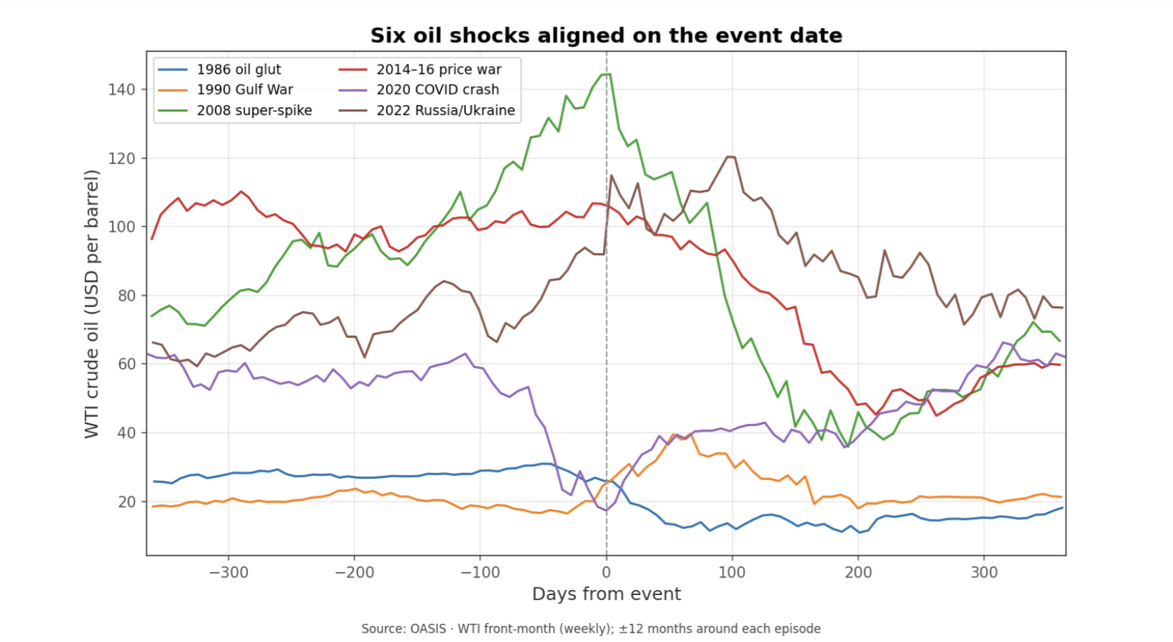
History leaves two working rules: thin spare capacity makes moves more violent, and geopolitical spikes tend to fade unless barrels are truly removed from the market.
That leaves us with a strong prior before we even turn to Hormuz. If the market is reacting to a geopolitical scare but barrels still flow, the move should tend to round-trip within months. If a violent move persists, the reason is usually not the headline in isolation but the physical supply channel the event touched. And across these episodes the unexplained share stays large — 89–98% of the weekly moves in the major post-2008 shocks — which should keep us modest about any tidy narrative.
Hormuz is the right final test
Only after building the framework did we turn to Iran and the Strait of Hormuz as the closing case study. The first point is structural importance, and on that the data are straightforward. About 20.9 mb/d moved through Hormuz in 2023, around 20.4% of global liquids output, making it the second-busiest chokepoint by raw volume and the one with the fewest practical alternatives. On importance, the narrative is right.
The second point is how the 2026 disruption is best measured. Official transit-volume series are published with a long lag, so the scale of the throughput collapse is read more reliably from price and shipping signals than from headline flow counts — and on those signals the disruption is unmistakable, with tanker traffic through the strait reported down more than 80% at the peak.
The third point is the distinction between a threatened closure and a realized one. In June 2025, the common narrative was that Iran and Hormuz were driving oil higher. WTI spiked about 23% and then round-tripped within two weeks. Brent-WTI narrowed to about +$2.46, below its +$5.19 24-month average, and Dubai showed no Asian premium. That is what a fear spike looks like when the physical system does not break.
The 2026 closure looked different. Brent-WTI widened sharply, peaking near +$18 in April and averaging roughly +$11 over the disruption window. Dubai, however, did not gain an Asian premium. Its discount to Brent blew out to -$13.7 in March and -$24.4 in April. That is a crucial finding because it inverts the naive script. The market response was not Asia bidding Gulf crude higher. It was Gulf crude being stranded behind the strait, depressing the Gulf marker relative to the globally deliverable Atlantic benchmark. In other words, the spread pattern confirms a real disruption, but by showing trapped supply rather than a classic scarcity premium in Dubai.
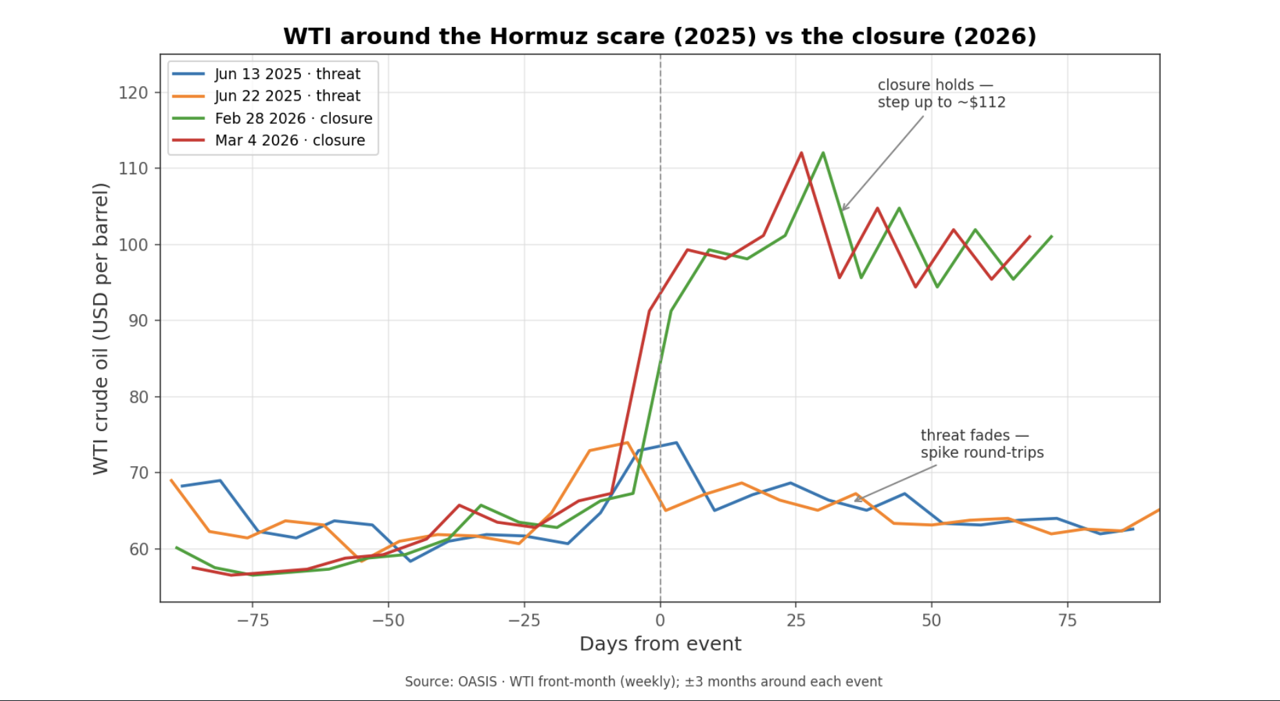
The two June 2025 scare dates (blue, orange) spike and round-trip within weeks; the two 2026 closure dates (green, red) step up to roughly $112 and hold. A threat that faded versus a closure that realized.
The supply data align with that reading. Over the recent 12 months, WTI's tightest relationships were with OPEC production at -0.95 and OPEC spare capacity at -0.94. OPEC output fell from 30.78 mb/d in February 2026 to 20.16 by May, and spare capacity collapsed from 3.01 to 0.03. The US dollar and US production explained essentially nothing over that window. Put simply, the oil market was moving with Gulf supply conditions, not with US supply or currency conditions. This is the key interpretive point: in 2026, we cannot cleanly pit "Hormuz" against "fundamentals," because the closure is itself the supply fundamental. The shock shows up as lost deliverable Gulf output and vanished usable spare capacity.
The fuller statistical picture reinforces the same lesson. In a decade-long monthly model (2015–2026), OPEC production accounts for 12.3% of WTI's movement, OECD inventories 3.7%, Russia 2.1%, and a direct "Hormuz event" term just 0.85% — with roughly 80% unexplained. That small event share should not be over-read: it swings from well under 1% to about 8% depending on how the model is built, because the Hormuz term is statistically entangled with the OPEC supply collapse the closure caused. The honest takeaway is the range, not any single figure — and the mechanism matters more than the percentage: the closure moved price through the supply channel, not as a standalone headline premium.
So the balanced answer is clear. When Hormuz is only threatened, the "Iran drives oil prices" story usually overstates the evidence. When Hormuz is actually closed, the story becomes correct, but correct as a physical Gulf-supply shock rather than as a pure geopolitical premium. And even there, we should remember that roughly 70-90% of month-to-month oil movement stays statistically unexplained. The framework helps us read the event better, but it does not turn oil into a one-variable market.
Implications
What the research suggests is a practical reading order for oil. Start with the structure: who produces, who consumes, which benchmark is moving, and whether the key regional spreads are confirming a real seaborne disruption. Then check the levers: spare capacity, broad inventory deviations, the dollar, and whether shale can respond over the next few quarters. Only after that should we decide whether a geopolitical narrative deserves to be treated as a genuine fundamental shock. For readers tracking macro transmission, the crack spread remains the useful bridge from crude to consumer prices, while the Hormuz case study leaves a clear operating rule: fade the familiar scare until spread and supply data confirm conversion, but once production and deliverability actually break, treat the move as a real supply event rather than a temporary headline premium.
What to Watch
Brent-WTI versus its roughly +$5 norm; sustained widening is the cleanest real-time sign that a Gulf or seaborne disruption is becoming global rather than staying local.
Dubai-Brent; a sharply deeper Dubai discount can signal stranded Gulf supply. It is a monthly gauge, so it confirms a shift more slowly than the daily Brent-WTI spread.
OPEC production and spare capacity together; if output falls and spare capacity compresses toward zero, the market is no longer pricing fear but an actual supply constraint.
OECD commercial stocks relative to normal, not just the weekly US crude print; the broad inventory deviation carries more signal than the headline Wednesday number.
Humility on any single-cause story; roughly 70-90% of oil's month-to-month move stays statistically unexplained, so treat any precise "X% was Hormuz" attribution with skepticism.
Look out for next week’s newsletter for further insight into the forces shaping today’s markets.